01Home→
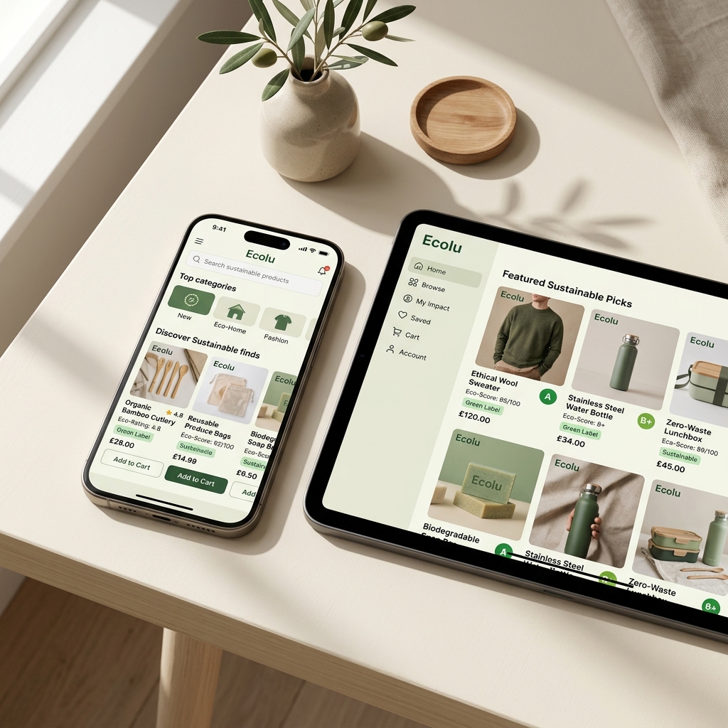
Categories and curated product groups help users start browsing without needing to understand every sustainability detail immediately.
A calm shopping concept that helps users understand eco-friendly choices through simple categories, transparent labels, and clear product information.
The challenge was to make sustainable shopping feel simple, trustworthy, and less overwhelming.
UX/UI design, information architecture, visual concept, prototype thinking
Reduce cognitive load and make product decisions easier
People interested in sustainable shopping but unsure what to trust
App flow, product cards, category logic, checkout and profile concept
Sustainable shopping often becomes tiring because users must compare labels, materials, brand claims, and impact information across many sources.
I focused the concept around clear sustainability tags, reason-based product cards, and a structure where users can understand why a product is considered a better option.
The interface uses generous spacing, soft product cards, simple tags, and a calm color palette to avoid the overloaded eco-marketplace feeling.
Categories and curated product groups help users start browsing without needing to understand every sustainability detail immediately.
Product pages explain the sustainability reason in plain language, supported by badges and a short why-this-matters area.
The profile gives users small visual rewards and makes their preferences easier to continue across future shopping sessions.
The concept became less like a generic shop and more like a guided decision-making tool. Next, I would test the category logic with users and build a more complete prototype with empty states, filter behavior, and clearer onboarding decisions.