Turning Complex Technology Into a Clear, Benefit First Story
An independent concept redesign for a deep tech startup, reframing a technology heavy website into a clear, human, benefit first experience centered on its world first 3D ear scanner.
How might a deep tech company communicate a complex, world first technology in a way that feels clear and human, without losing the credibility its expert audience expects?
Many deep tech and medical websites lead with the technology, terminology, and engineering detail. This builds authority with experts but loses first time visitors, who cannot quickly understand what the product does for them. The challenge was to reframe the experience to lead with benefit first and technology second, while still serving technical audiences like audiologists and investors.
The Solution
A Benefit First Experience That Translates Technology Into Human Value
I restructured the site around a clear principle: benefit first, technology second. I designed a benefit led homepage, a dedicated 'AKuris product world' that tells the full product story from problem to demo to contact, and a clear information architecture that routes patients, audiologists, and investors to the right content. Complex science was translated into plain language, with technical depth kept one click away for expert readers.
Final UI Showcase
01 / 06
HOME PAGE
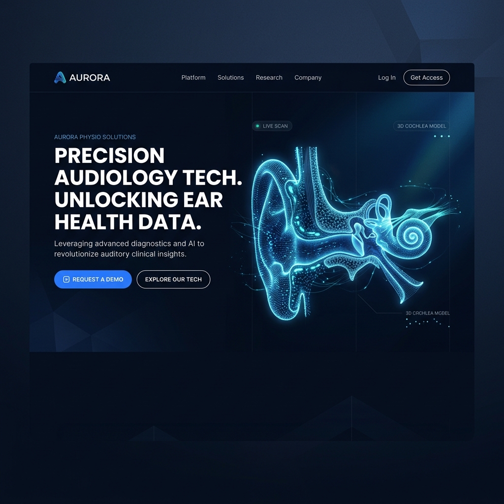
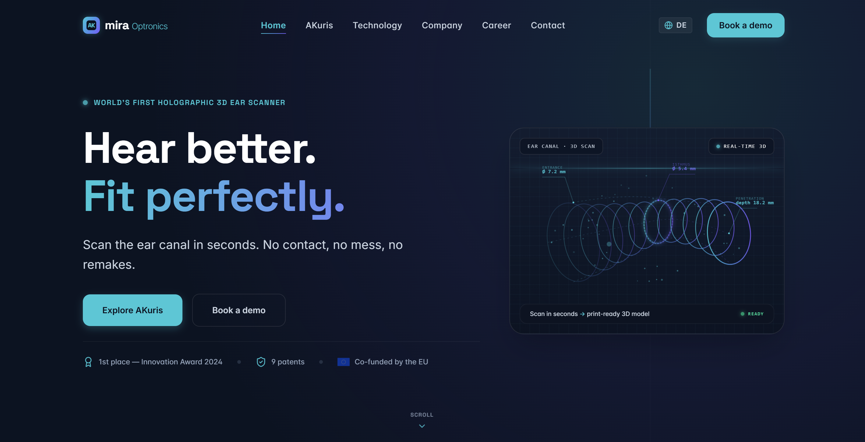
Benefit First Homepage
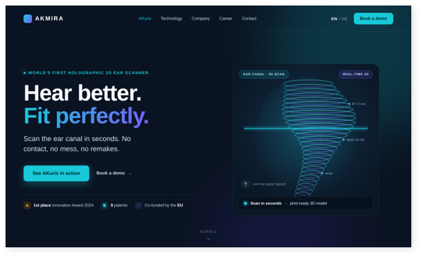
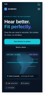
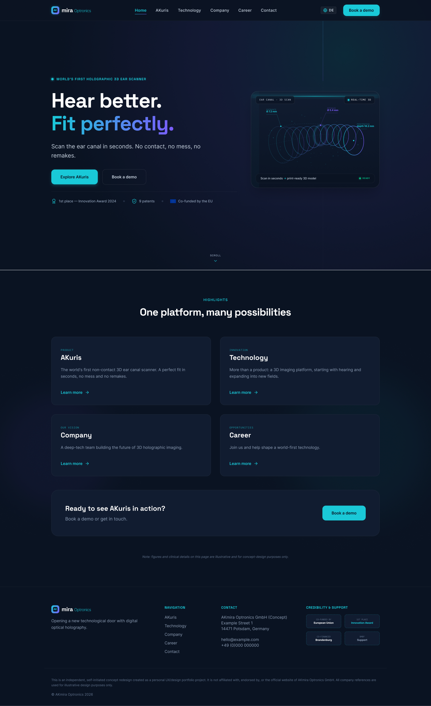
Leads with the benefit and the world first claim, with the product visible immediately instead of buried below company information.
akmira.com/home
BACKGROUND
Designing a Benefit First Experience for Deep Tech
This project began as an independent concept exploration of how a deep tech medical startup could present a complex, world first technology more clearly. The original site led with dense scientific language, which built credibility with experts but made it hard for first time visitors to understand the product's value. I wanted to explore how thoughtful structure, plain language messaging, and a benefit first hierarchy could make the technology feel accessible without losing its authority.
"The goal was not to simplify the science, but to translate it, so anyone could feel its value in seconds."
This idea became the foundation for the redesign, guiding both the user experience and visual design decisions throughout the project.
STARTING POINT
The Original Website
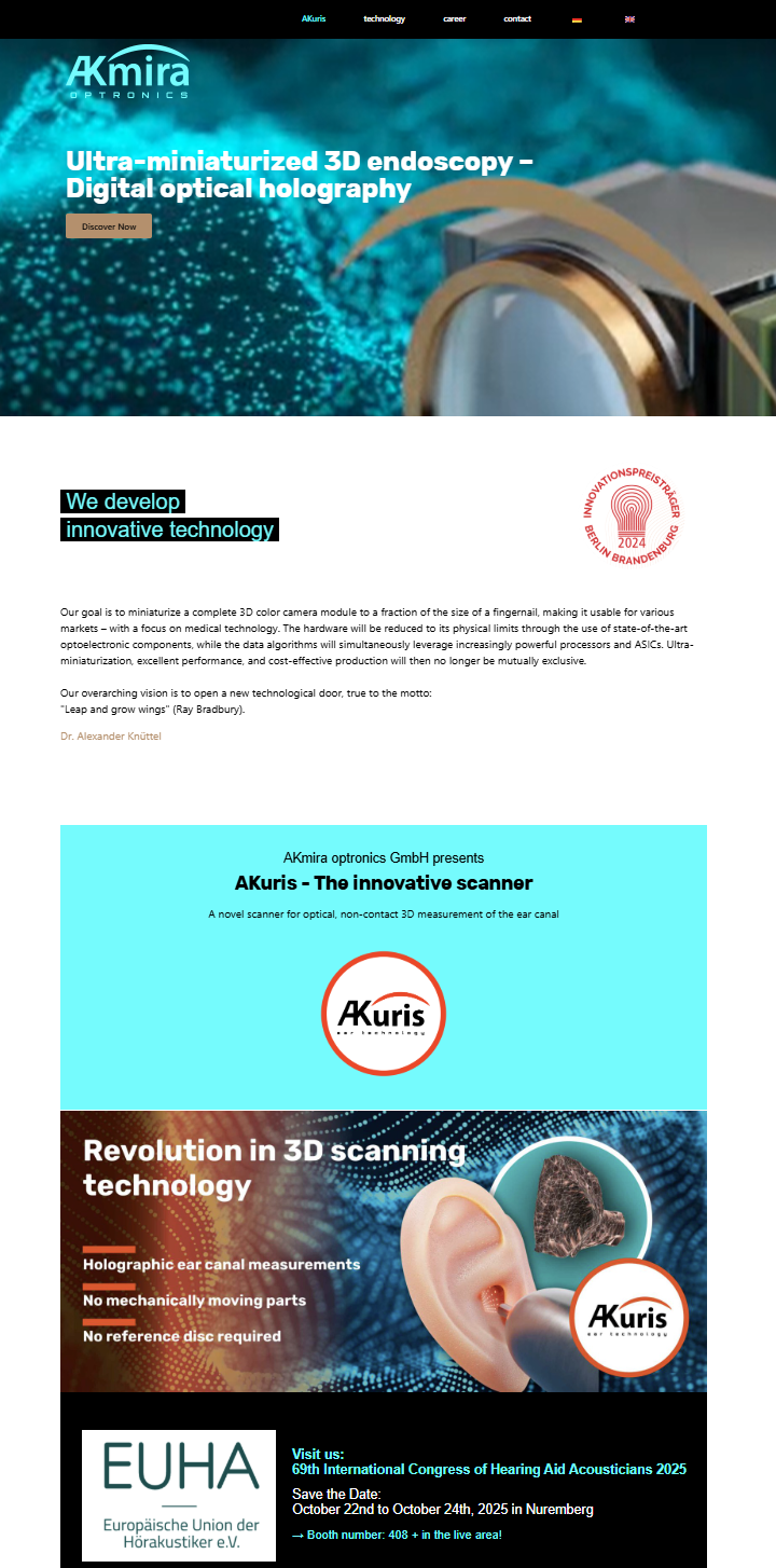
Before designing, I studied AKmira's existing website to understand what was working and what was holding it back. The site successfully conveyed scientific credibility, but it made the technology hard to understand for anyone outside the field. The core issue was clear: the site explained the science before it explained the benefit.
Key Problems to Address
Technology-first messaging"The site led with complex terminology before explaining what the product does for patients and clinics."
The product was buried"AKuris, the flagship product, appeared below company and technical information instead of leading."
A single long page"All content lived on one scrolling page, so no topic could go deep or be easily found."
One message for every audience"Patients, audiologists, and investors saw the same dense content, with no tailored path."
No visual proof"There was no demo or video showing the scan in action, so the core advantage stayed abstract."
These problems became the foundation for the redesign: lead with benefit, give the product its own space, create a clear structure, and show the technology in action.
akmira-optronics.de (before redesign)
The original single-page site, captured for this concept study.
RESEARCH
Understanding the Audiences and the Market
I studied the original website, the product, and comparable deep tech and medical device companies to understand how technical products communicate value. I identified three distinct audiences with different needs: patients, audiologists and clinics, and the market: investors, press, and partners.
Target Audiences
PATIENTS
Core Need
No mess, no waiting, a comfortable and modern experience.
CLINICS
Core Need
Precise digital data, clean workflow, no remakes.
INVESTORS
Core Need
A credible, ambitious innovation story with global potential.
SWOT Matrix Analysis
STRENGTHS
world first technology
patents and IP protection
EU backing and funding
WEAKNESSES
technology first messaging
product buried in dense text
heavy scientific terminology
OPPORTUNITIES
benefit first reframe
platform positioning
clearer user journeys
THREATS
overclaiming risk in a medical field
losing the expert audience if oversimplified
DEFINE
Bringing the User to Life
This persona is grounded in a real experience. A close family member went through the conventional ear impression process for a hearing aid, where the first mold did not fit correctly and had to be remade. That first hand experience shaped the design's focus on comfort, accuracy, and a better first time fit.
Understanding Our User: Meet Elena
Elena
Hearing Aid User
AGE62
OCCUPATIONRetired
LOCATIONGermany
Elena needs a comfortable, accurate ear fitting process and a hearing aid that fits correctly the first time.
GOALS & NEEDS
A comfortable, non invasive fitting experience.
A hearing aid that fits right the first time, without remakes.
To trust that the process is modern and precise.
FRUSTRATIONS
The cold, uncomfortable silicone impression process.
A first mold that did not fit and had to be redone.
Long waiting times before getting a working hearing aid.
HOW MIGHT WE
How might we lead with human benefit and proof, while keeping the technical depth that experts and investors rely on?
FEATURE ROADMAP
Feature Roadmap
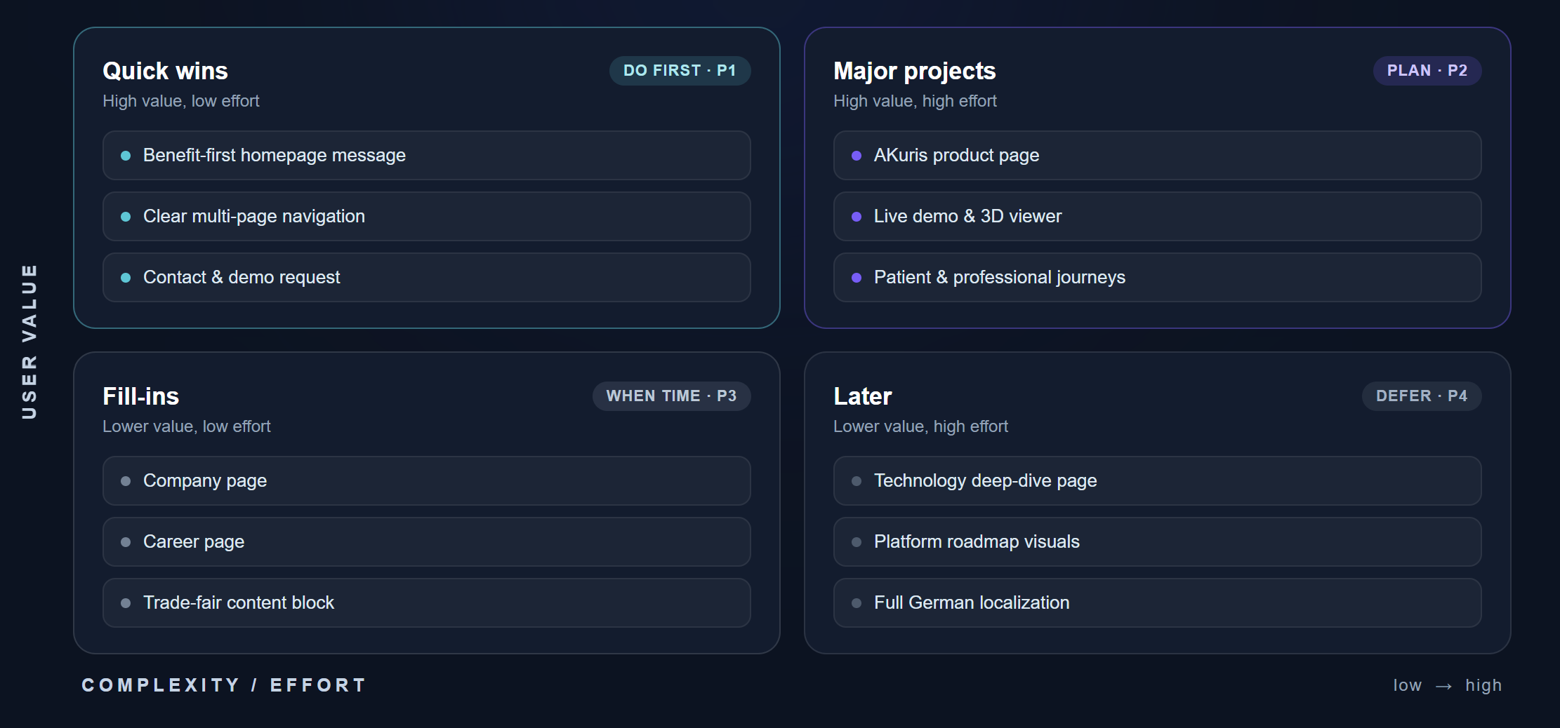
To define and prioritize the key functionalities of the AKmira Optronics digital presence, I created a feature roadmap that aligned both user needs and business objectives. The platform needed to support patient education, clinical workflow details, interactive product demonstrations, partner engagement, and clear language switching.
The following conceptual and functional features were identified as the most important components of the initial product interface:
• Homepage
• AKuris Product Page
• Live Demo & 3D Viewer
• Technology Page
• Platform Page
• Company Page
• Career Page
• Contact & Demo Request
• Trade Fair Content
• German Localization
These features were prioritized to help users easily discover the AKmira brand, explore technical scanner workflows, inspect 3D outputs with confidence, and build an ongoing relationship with the company.
Figure 2: Feature Roadmap priority matrix aligning user value against implementation complexity.
INFORMATION ARCHITECTURE
Translating Features into a Site Map
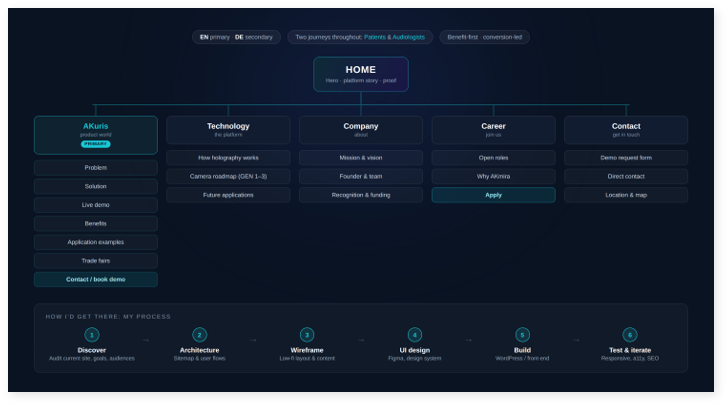
I replaced a single long page with a clear multi page structure. The homepage acts as a highlight reel that routes each visitor to the right deeper page: AKuris (full product story), Technology (science and roadmap), Company, Career, and Contact. Each page has one clear job.
The site map ensures that key actions such as exploring clinical studies, inspecting scan models, and booking product demonstrations remain accessible. By creating a clear hierarchy, I was able to design a seamless navigation experience that reflects AKmira's clinical and precise brand identity.
Figure 3: Information Architecture map for AKmira, grouping product worlds and company information.
DESIGN PROCESS
Designing a Calm and Conversion Focused Experience
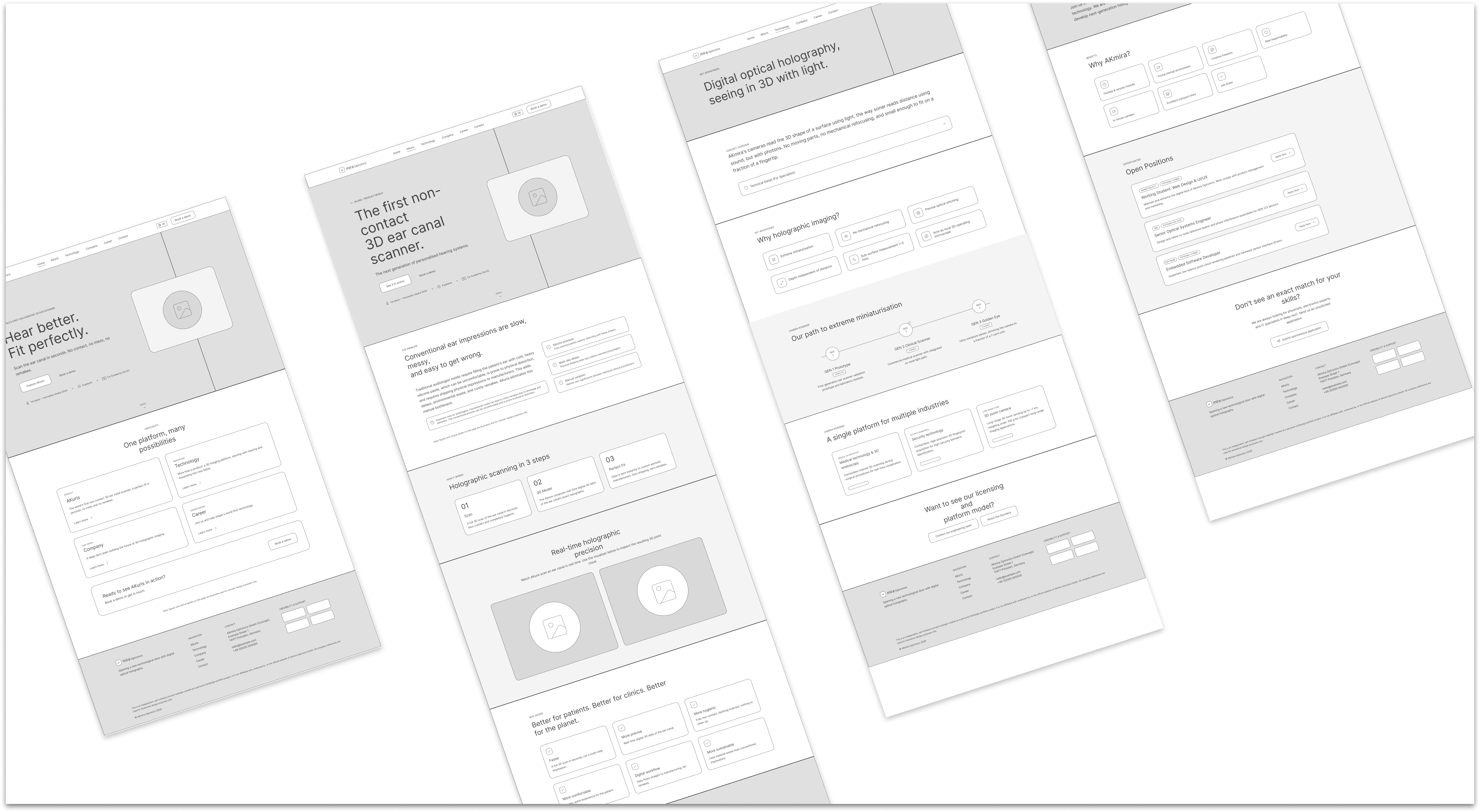
With the information architecture and user flows established, I began translating the experience into low fidelity wireframes. The goal was to define content hierarchy, page structure, and key conversion paths before introducing visual styling.
Throughout the wireframing process, I focused on:
Leading with benefit to instantly connect with patients and clinics
Giving the product its own world with the dedicated AKuris page flow
Putting the live demo before benefits so that tangible proof comes before marketing claims
Translating scientific language into plain English so first time visitors understand the value
By establishing the structure early, I was able to validate page layouts, user journeys, and business priorities before moving into the final visual design phase.
Crafting the Visual Design
A clean, premium, dark medical tech visual language with a holographic accent inspired by seeing in 3D with light. Every design decision was guided by the need for clinical credibility and futuristic precision.
To reflect user expectations, I focused on:
Dark clinical aesthetics: Establishing a high tech feeling matching medical software.
Holographic accent palette: Using neon cyan and violet accents to draw attention to interactive elements.
Technical geometric typography: Balancing Space Grotesk headings with highly readable body copy.
Precise UI elements: Designing forms, buttons, and mockups that feel premium and cohesive.
TYPOGRAPHY SPEC
Space Grotesk
Used for geometric headings to convey clean, precise, and clinical credibility.
Plus Jakarta Sans
Used for body copy and data labels to ensure highly readable browsing.
COHESIVE PALETTE
#0A1322
#19C9D8
#7C5CFF
#ffffff
TESTING & ITERATIONS
Refining the Experience Through Informal Testing
To evaluate clarity and flow, I conducted informal usability testing with three participants. The goal was not clinical validation, but to check whether a first time visitor could quickly understand what the product does, follow the benefit first story, find the live 3D viewer, and reach the contact step without confusion.
PARTICIPANT TESTING TASKS
Understand what AKuris does within the first few seconds.
Follow the AKuris product story from problem to solution.
Find and use the live 3D viewer.
Locate how to book a demo or get in touch.
Move between the main pages without getting lost.
All three participants understood the core message quickly and described the benefit first structure as clear and easy to follow. The sessions also revealed opportunities to improve layout balance and call to action styling, which I refined in the next iteration.
Iteration One: Refined Hero Visuals
Before: The initial design utilized an abstract circular scanning graphic to represent the scanner. While clean, it failed to communicate the core output of the product instantly.
After: I replaced the abstract circular graphic with an interactive 3D ear scan model showing the detailed point cloud output, giving the hero immediate clinical clarity.
Iteration Two: Simplified Page Routing
Before: The product story page combined too many dense sections in a single long scroll, making it hard to locate the live 3D viewer.
After: I structured the product story into a clear multi page layout and highlighted the live 3D viewer in a dedicated section with interactive controls.
1. Refined Hero Visuals
AFTER REDESIGN
2. Simplified Page Routing
AFTER REDESIGN
OUTCOMES & IMPACT
Measurable Improvements
The final design successfully reframes the digital presence of AKmira Optronics into a clear, benefit first story centering on the world first 3D ear scanner.
Through usability validation, the new multi page structure successfully guides patients, clinics, and investors to tailored content. The integration of the live 3D viewer makes the abstract scanner technology tangible and interactive. The resulting experience positions the startup as an ambitious platform leader while keeping the scientific credibility experts expect.
6
Pages Structured
Home, AKuris, Technology, Company, Career, and Contact, each with one clear job.
3
Audiences Served
Patients, audiologists, and investors routed to tailored content.
1
Interactive 3D Viewer
A live point cloud viewer making an abstract technology tangible.
2
Hero Iterations
Self critiqued and improved from concept to refined direction.
Interactive Walkthrough
Watch the video overview showcasing patient paths, clinical workflows, and responsive layouts:
Final Design Video Walkthrough
Click to play the interactive video walkthrough presentation.
AKmira Optronics redesign began as a concept exploration of how a medical technology startup could extend its scientific credibility into a clear, benefit first digital experience. From defining target audiences and user journeys to establishing information architecture, every decision was guided by precision, clarity, and user needs.
What I Learned
This project reinforced how much structure and language shape whether a complex product feels understandable. The hardest and most valuable work was translating technical depth into clear human benefit without losing credibility.
Next Steps
With more time, I would test the structure with real audiologists, refine the German language experience, and replace concept placeholders with real product visuals and scan data.
What I'm Most Proud Of
Taking a dense, technology first site and reframing it into a clear, benefit first experience, while building a working interactive prototype, including a live 3D viewer.
This is an independent, self initiated concept redesign created as a personal design portfolio project. It is not affiliated with, endorsed by, or the official website of AKmira Optronics GmbH. Company references are used for illustrative, educational design purposes only.