How might a cafe create a digital experience that feels as warm, calm, and intentional as sitting down with a carefully crafted cup of coffee?
Modern cafe websites often focus purely on utility like menus or quick online ordering, leaving little room for atmosphere and brand identity. The challenge for this conceptual project was to design and build a digital presence from the ground up that balances practical user needs, like discovering items and finding information, with the slow and comforting philosophy behind the Cafe Kish brand.
The Solution
A Calm and Brand Driven Experience Built from Scratch
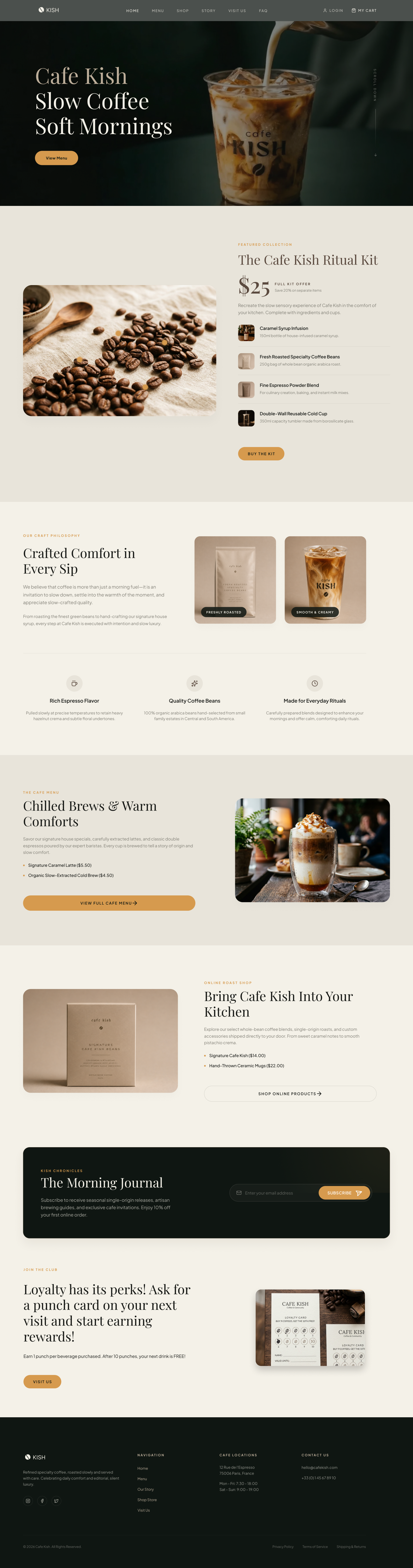
I designed Cafe Kish from the ground up, creating a digital space that merges visual storytelling with functional design. Through thoughtful information architecture, intuitive navigation, and a warm, calm visual language, the website makes it easy for users to explore the brand and discover the menu. The final product is a welcoming interface that successfully mirrors the peaceful and intentional atmosphere of a physical coffee house while showcasing conceptual elements like a shopping cart and customer support chat.
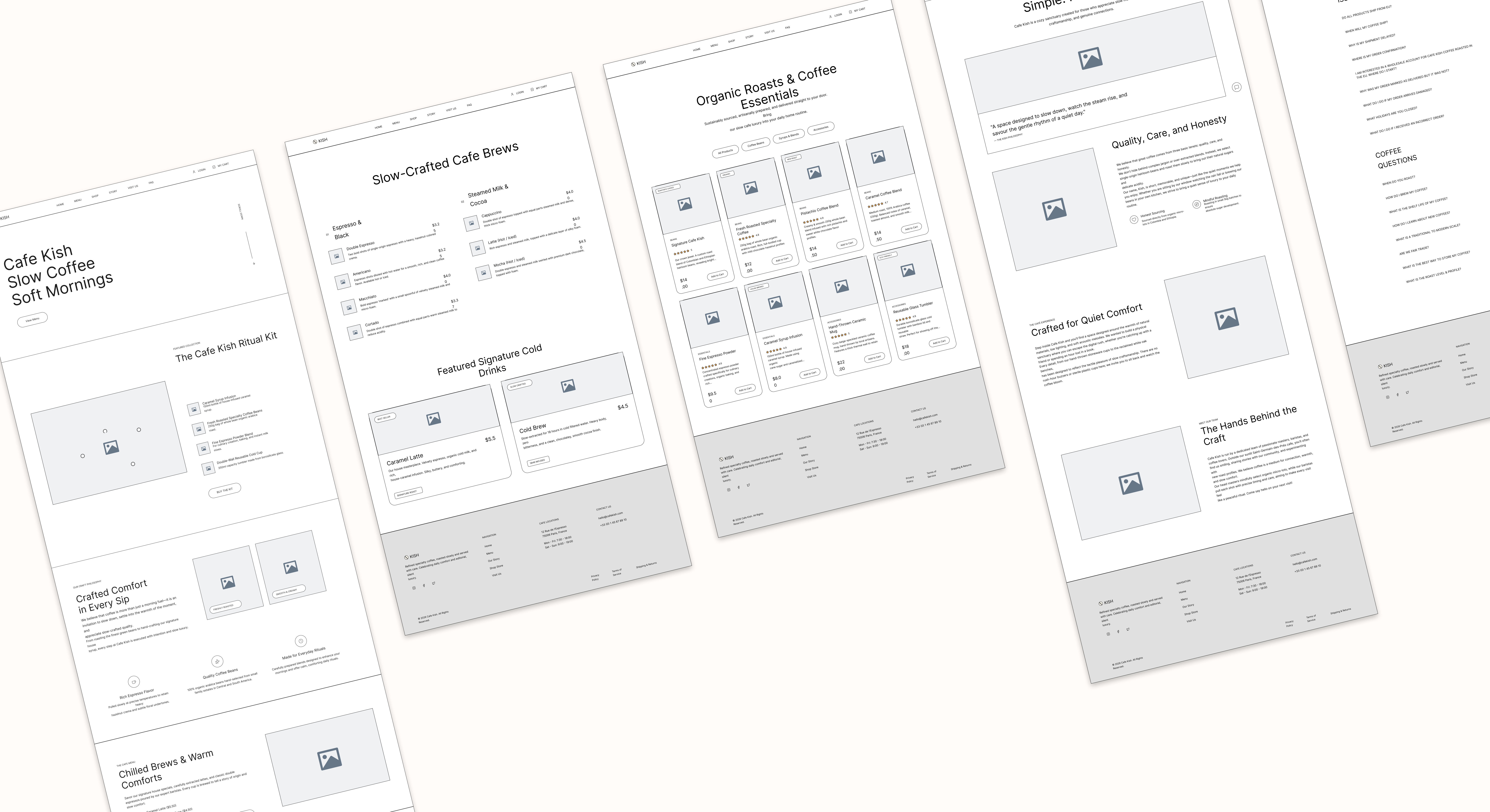
Final UI Showcase
01 / 06
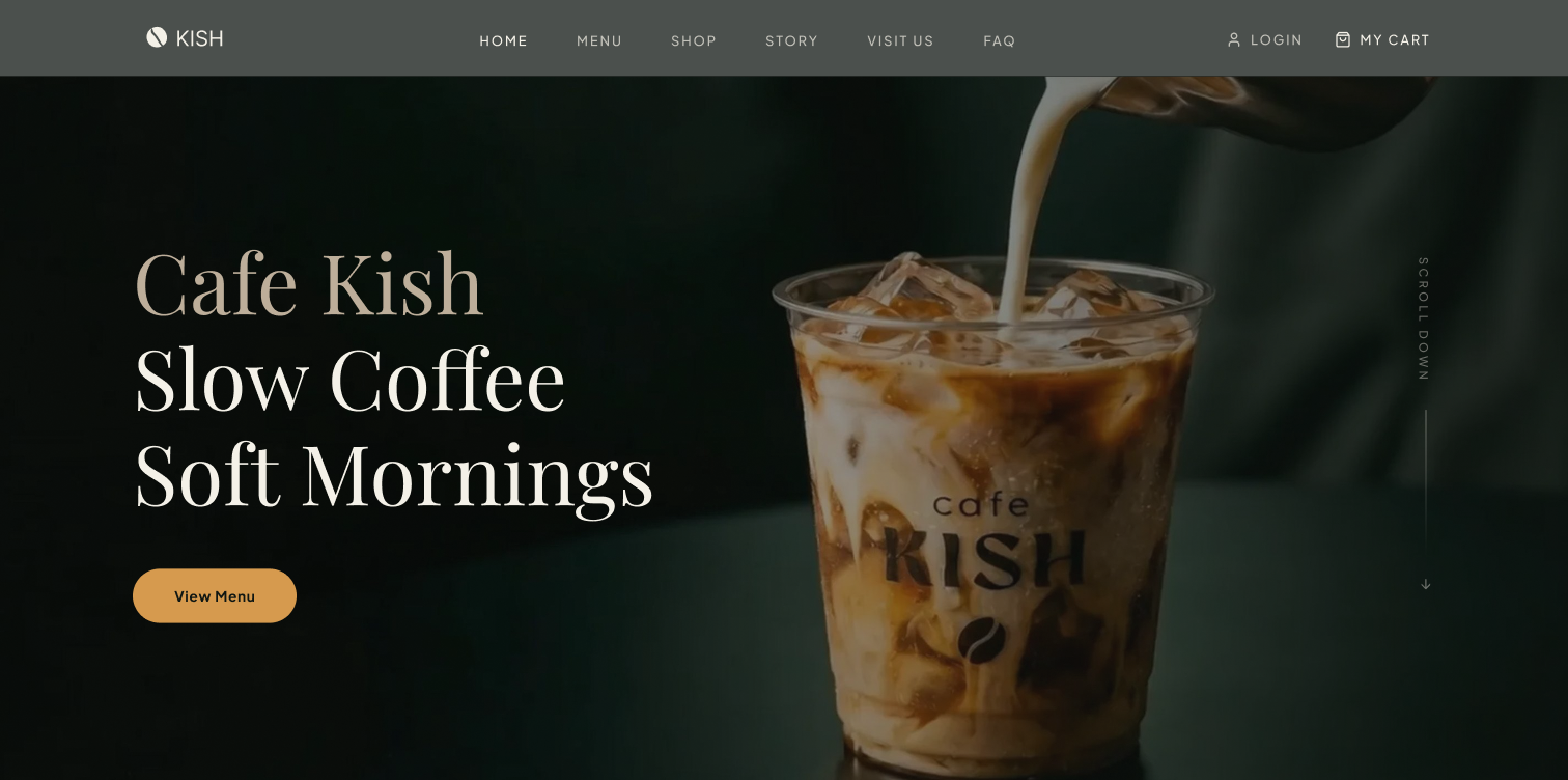
HOME PAGE
Calm Sensory Portal
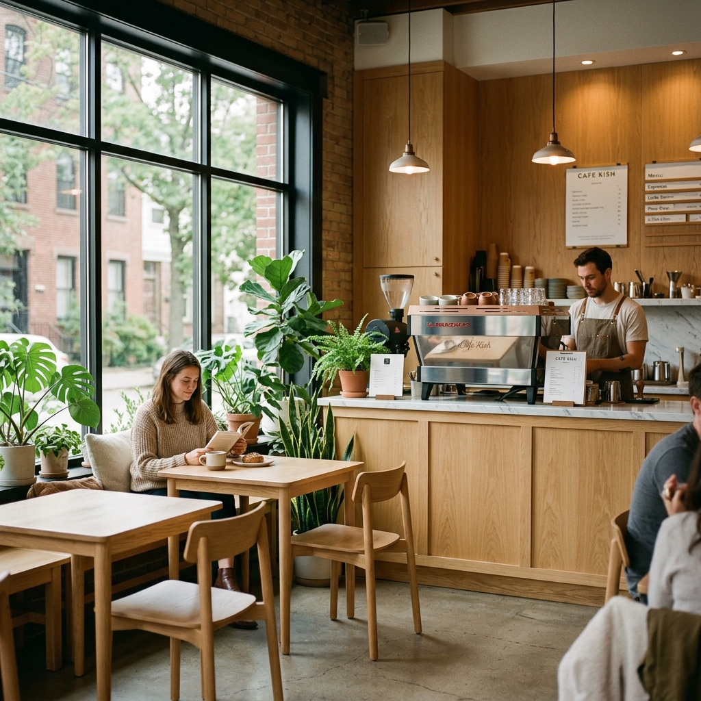
The homepage immediately immerses visitors in the warm and beige aesthetic of the brand. It features a stunning interactive scroll animation in the hero section where milk gracefully pours into an iced coffee as the user scrolls down the page. Rather than overwhelming the user, the layout flows seamlessly through sections highlighting the ritual kit, the craft philosophy, and the loyalty program. Large and inviting photography of roasted beans creates a sensory rich experience that encourages further exploration.
cafekish.com/home
BACKGROUND
Designing a Digital Home for a Modern Cafe Brand
Cafe Kish was created as a concept project exploring how a specialty coffee brand could extend its physical atmosphere and core values into a digital space. While many cafe websites focus purely on utility like menus and online ordering, I wanted to build a platform that also communicated the warmth, craftsmanship, and slow living philosophy behind the brand.
The challenge was to balance multiple user needs within a single unified interface. Visitors needed to seamlessly discover the cafe, explore product offerings, learn about the brand story, find practical location information, and engage with shopping features without ever feeling overwhelmed.
"For many consumers, the experience of visiting a café goes beyond just the coffee. It's about atmosphere, comfort, and connection."
This idea became the foundation for Cafe Kish, guiding both the user experience and visual design decisions throughout the project.
RESEARCH
Competitive Analysis: Benchmarking Leading Coffee Brands
To better understand user expectations and industry standards, I reviewed several established coffee brands. The goal was to identify design strengths and layout opportunities that could inform the visual direction for Cafe Kish.
Competitors Analyzed
CAFÉ KITSUNÉ
Café Kitsuné
STORYTELLINGPREMIUM
Strong storytelling and premium photography
Consistent brand identity across touchpoints
COUTUME
Coutume Café
E-COMMERCESPECIALTY
Well-developed e-commerce experience
Clear navigation and product lists
TERRES DE CAFÉ
Terres de Café
SOURCINGDIVERSITY
Strong origin and trace details
Easy-to-use search and purchase flow
STARBUCKS
Starbucks
LOYALTYMASS MARKET
Highly optimized mobile ordering
Extremely robust loyalty program
SWOT Matrix Analysis
STRENGTHS (FOR STORYTELLING & FLOW)
Strong visual storytelling and premium photography
Clear navigation and product categorization
Consistent brand identity across digital touchpoints
Well-developed e-commerce experiences
WEAKNESSES (FOR USABILITY)
Important information occasionally buried within content-heavy pages
Some websites prioritize aesthetics over usability
Limited visibility of customer support and contact options
OPPORTUNITIES (FOR CAFE KISH)
Create a stronger connection between the digital and in-person café experience
Combine brand storytelling with seamless product discovery
Improve customer engagement through loyalty and subscription experiences
Surface support and assistance throughout the customer journey
THREATS (TO MITIGATE)
Growing competition within the specialty coffee market
Increasing user expectations for online shopping experiences
Overly complex interfaces that create friction and reduce engagement
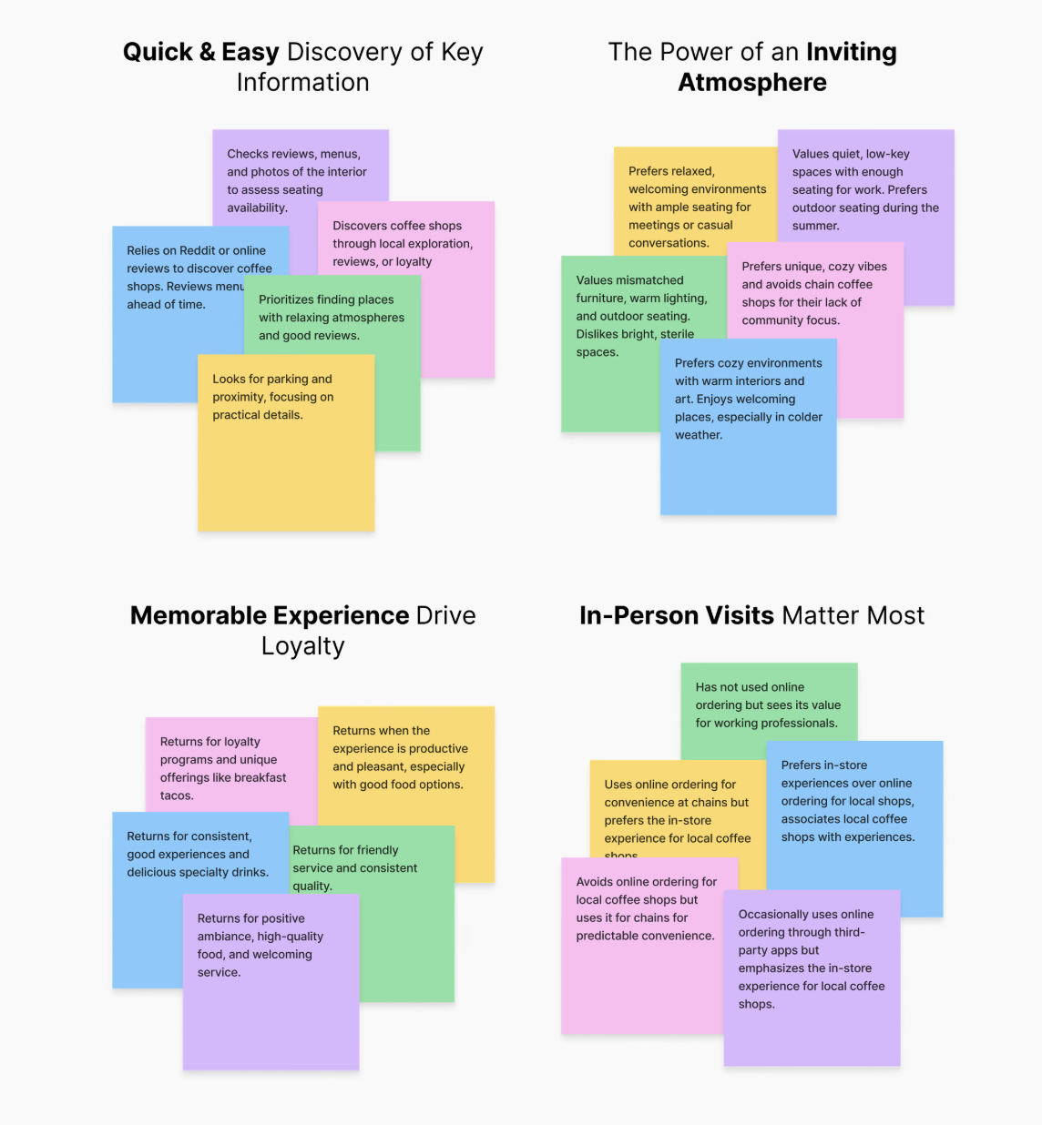
User Interviews: What Cafe Lovers Really Want
Through five in-depth interviews with frequent cafe-goers, I explored their needs, preferences, and frustrations when choosing and visiting cafes. I then analyzed my findings and created an affinity map to uncover key themes:
Figure 1: Affinity Map showing key themes around comfort, digital discovery, and order accessibility.
DEFINE
Bringing the User to Life
To make my research findings more tangible, I created a user persona which provided a holistic view of the target user that will shape my design decisions.
Understanding Our User: Meet Chris!
Chris
Café Enthusiast
AGE28
OCCUPATIONGraphic Designer
LOCATIONParis, France
Chris needs a local coffee shop that is welcoming, community-focused, and offers easy access to essential information online.
GOALS & NEEDS
Wants a local coffee shop that feels warm and community-driven.
Needs fast access to operating hours and menus on a mobile viewport.
Values transparency regarding coffee bean washing, roasting, and origin details.
FRUSTRATIONS
Buried cafe locations and operating hour cards on old sites.
Inability to buy roasted beans online or customize subscription kits.
Physical stamp cards are easily lost or forgotten.
HOW MIGHT WE...
How might a café create a digital experience that feels as warm, calm, and intentional as the experience of sitting down with a carefully crafted cup of coffee?
FEATURE ROADMAP
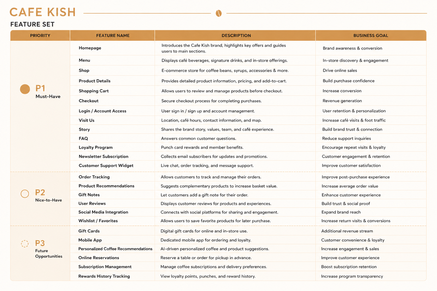
Feature Roadmap
To define and prioritize the key functionalities of Cafe Kish, I created a feature roadmap that aligned both user needs and business objectives. As Cafe Kish combines a physical cafe experience with an online specialty coffee shop, the platform needed to support product discovery, online purchasing, brand storytelling, customer engagement, and long term loyalty.
The following conceptual and functional features were identified as the most important components of the initial product interface:
• Homepage
• Menu
• Shop
• Product Details
• Shopping Cart & Checkout
• Login / Account Access
• Story
• Visit Us
• FAQ
• Customer Support Widget
• Newsletter Subscription
• Loyalty Program
• Order Tracking
• Product Recommendations
These features were prioritized to help users easily discover the Café Kish brand, explore products and menu offerings, make purchases with confidence, and build an ongoing relationship with the café through subscriptions, rewards, and customer support.
Figure 2: Feature Roadmap priority matrix aligning user value against implementation complexity.
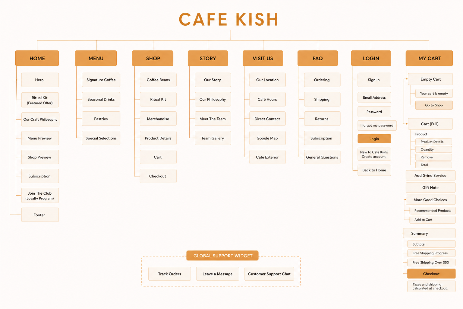
INFORMATION ARCHITECTURE
Translating Features into a Site Map
With the core features and user journeys defined, I translated them into a site map to establish a clear and intuitive information architecture. The structure organizes content into logical sections, helping users easily navigate between the café experience, online shop, account features, and customer support resources.
The site map ensures that key actions such as exploring the menu, purchasing products, managing a cart, and finding café information remain accessible while supporting both business goals and user needs. By creating a clear hierarchy, I was able to design a seamless navigation experience that reflects Cafe Kish's calm, welcoming, and thoughtfully crafted brand identity.
Figure 3: Information Architecture map for Cafe Kish, grouping digital shop elements and café details.
DESIGN PROCESS
Designing a Calm and Conversion-Focused Experience
With the information architecture and user flows established, I began translating the experience into low-fidelity wireframes. The goal was to define content hierarchy, page structure, and key conversion paths before introducing visual styling.
Throughout the wireframing process, I focused on:
Clear content hierarchy to guide users through the café experience
Strategic placement of calls-to-action to support menu exploration and online purchases
Balanced layouts that combine storytelling, product discovery, and customer engagement
Consistent navigation patterns to create a seamless browsing experience
By establishing the structure early, I was able to validate page layouts, user journeys, and business priorities before moving into the final visual design phase.
Crafting the Visual Design
To bring the Cafe Kish brand to life, I focused on creating a visual language that reflected warmth, comfort, and slow-crafted quality. Every design decision was guided by the café's philosophy of mindful rituals and quiet luxury.
To reflect user expectations, I focused on:
Warm, inviting visuals – Creating a calm and welcoming atmosphere.
A cohesive color palette – Using soft neutrals and caramel accents to reinforce the brand identity.
Refined typography – Balancing elegant serif headings with highly readable body text.
Consistent UI components – Designing buttons, forms, cards, and interactions that feel unified across the experience.
Every design choice, from imagery and typography to interface components, was selected to capture Cafe Kish's slow-crafted atmosphere while maintaining a cohesive and memorable brand experience.
TYPOGRAPHY SPEC
Playfair Display
Used for serif headings to convey calm luxury and slow comfort.
Plus Jakarta Sans
Used for body copy, options, and lists to ensure highly readable browsing.
COHESIVE PALETTE
#0F1612
#F4F1E8
#5B4A3F
#D69A4E
TESTING & ITERATIONS
"This Feels Like a Place I Would Want to Visit"
To evaluate the overall experience, I conducted informal usability testing with five participants. The goal was to understand how easily users could navigate the website, discover key information, and complete common tasks while experiencing the calm and welcoming atmosphere of the Cafe Kish brand.
PARTICIPANT TESTING TASKS
Locate the café's opening hours and address
Browse the menu and find a featured signature drink
Explore the online shop and locate a specific coffee product
Find customer support and contact options
Access account and cart functionality
All five participants successfully completed the tasks and described the experience as intuitive and visually cohesive. Several participants commented that the design felt calm, premium, and aligned with the atmosphere they would expect from a modern specialty coffee brand.
However, the testing process also revealed a few opportunities to improve discoverability and streamline key user journeys.
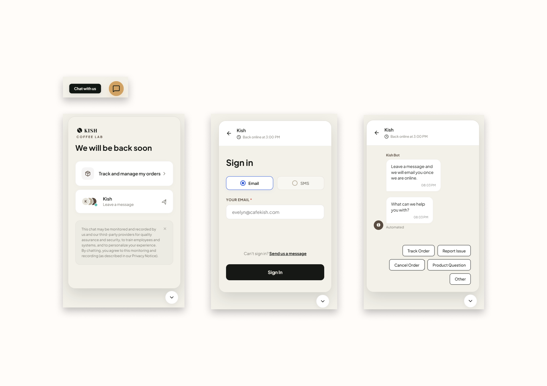
Iteration One: Customer Support Accessibility
Before: Users had to navigate entirely to the Visit Us page to find a traditional and static contact form. While functional, it felt disconnected from the immediate shopping or browsing experience.
After: I replaced the static form with a globally accessible and floating chat widget. This interactive element provides instant access to order tracking, automated support routing, and direct messaging from absolutely any page on the website.
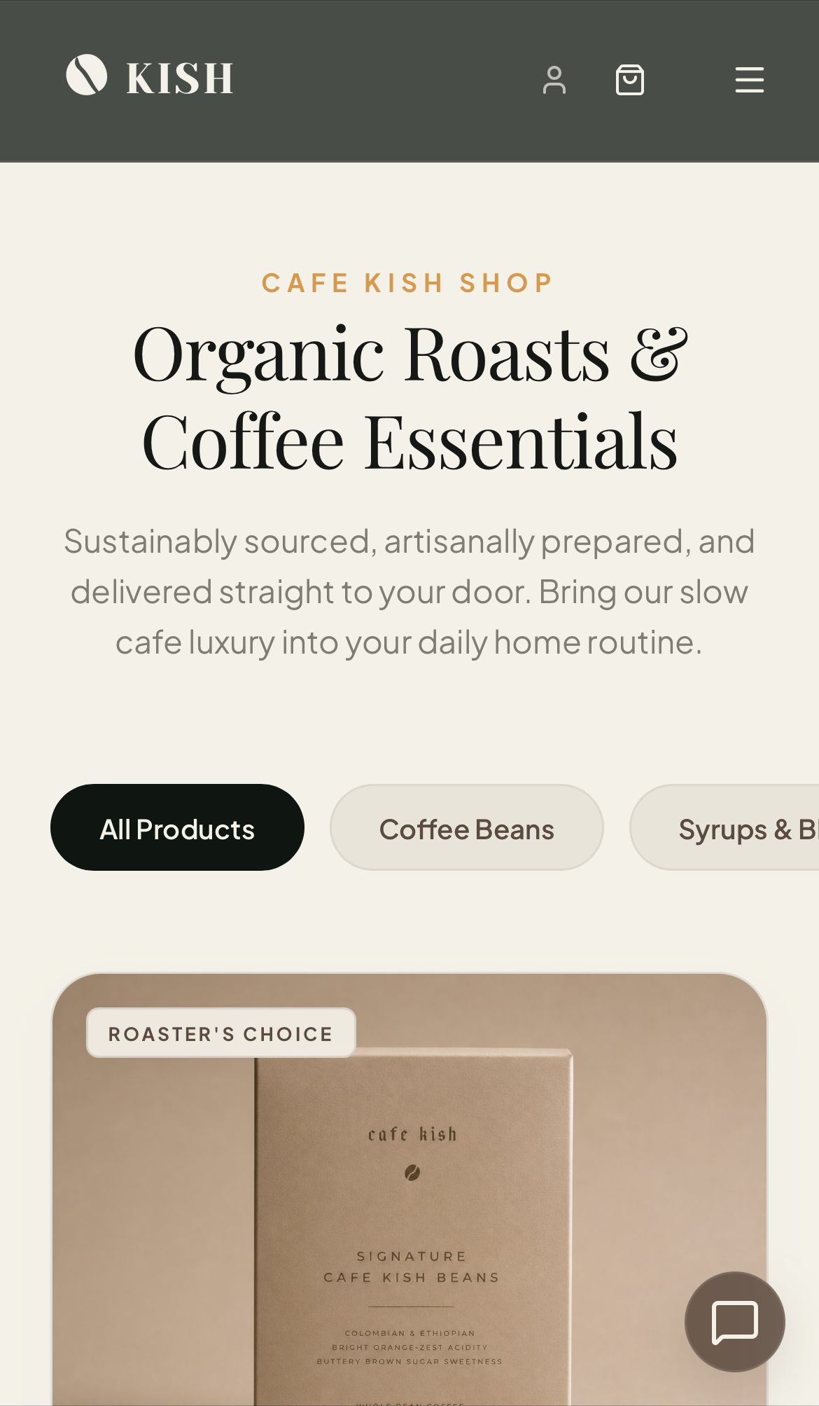
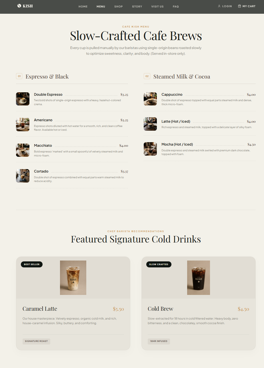
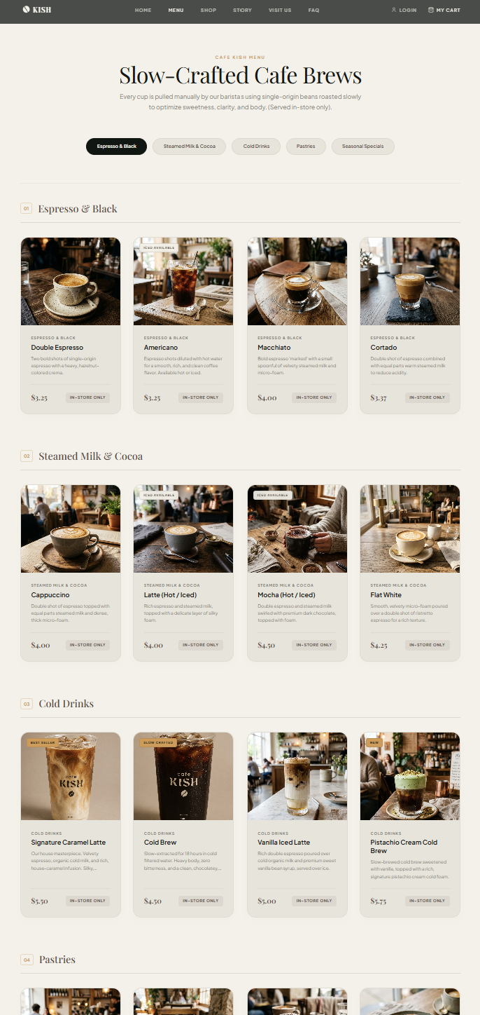
Iteration Two: Menu Items Discovery
Before: The original menu utilized a text heavy layout where users had to scroll extensively to find specific drink categories.
After: I transformed the menu into a highly visual grid, giving every single drink and pastry a large and appetizing photograph. I also introduced sticky category filter buttons at the top of the page, allowing users to jump instantly to sections like Pastries or Cold Drinks without excessive scrolling.
1. Customer Support Accessibility
AFTER REDESIGN
2. Menu Items Discovery
AFTER REDESIGN
OUTCOMES & IMPACT
Measurable Improvements
The final design successfully combines café discovery, online shopping, brand storytelling, and customer engagement into a single cohesive experience.
Through iterative refinement, key user journeys became more intuitive, including product browsing, customer support, and account access. The addition of a global support widget improved accessibility across the site, while category filtering and featured product organization made the online shop easier to navigate and explore. The resulting experience reflects the calm, welcoming atmosphere of Cafe Kish while supporting both business goals and customer needs through clear navigation, consistent visual design, and thoughtfully designed conversion paths.
8
Core Pages Designed
Complete layouts detailing home, menu, ordering flows, and dashboards.
20+
Reusable Components
Unified design system primitives for buttons, inputs, filters, and cards.
3
Primary User Journeys
Highly optimized purchasing, contact, and loyalty collection pathways.
2
Major Design Iterations
Usability findings directly structured back into visual layout updates.
Interactive Walkthrough
Watch the video overview showcasing customer dashboard, purchase flows, and responsive layouts:
Final Design Video Walkthrough
Click to play the interactive video walkthrough presentation.
Cafe Kish began as an exploration of how a modern café brand could extend beyond its physical space and create a cohesive digital experience. From defining the information architecture and user journeys to designing the interface and e-commerce experience, every decision was guided by the idea of slow comfort, simplicity, and craftsmanship.
What I Learned
This project reinforced the importance of designing beyond individual screens. Creating Cafe Kish required balancing brand storytelling, product discovery, customer support, and e-commerce functionality within a single experience. It also highlighted how information architecture, content hierarchy, and consistent design systems work together to create a seamless user journey.
Next Steps
With more time, I would expand the experience by developing a complete digital loyalty program, personalized customer accounts, and a richer subscription management system. I would also conduct additional usability testing with a larger participant group to validate assumptions and further refine key user flows.
What I'm Most Proud Of
I'm most proud of creating a complete end-to-end product experience from concept to final interface. From the initial site map and wireframes to the visual identity and interactive features, every element was designed to support a clear vision and create a digital experience that feels as warm, calm, and welcoming as the Cafe Kish brand itself.